Remember that colour is not a natural phenomenon that follows a set of rules like gravity.
Colour is so Interesting
Colour is highly variable depending on the amount of light and the colours of adjacent objects. A car may appear to be red in colour during the day, yet may appear black under street lights. The actual colour of the car is called its Local Colour. The colour we see, which is constantly changing due to changes in light, is referred to as Perceived Colour.
Most painters will tend to paint perceived colours, rather than use local colours. But what about feelings and emotions? What if we were to use colour in the way we feel it to be right. Good examples would be Matisse’s Fauve paintings or Monet’s Rouen Cathedral paintings.


Try this idea for a painting. Use the perceived colours of a scene and create a colour plan for your painting based on that. Now let’s make some adjustments. Before we do we, need to understand the following colour terms.
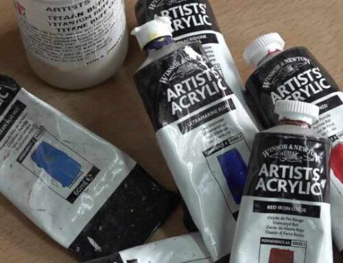
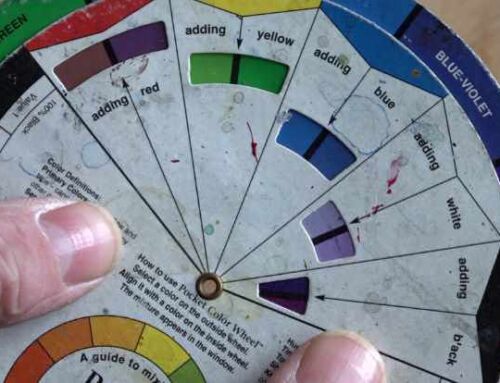
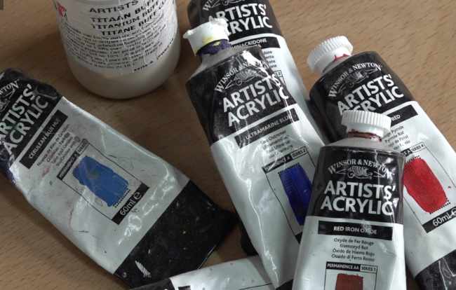
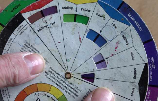
- Value – is a measurement of the brightness of a colour. The brighter the colour the higher its value. A vivid yellow is brighter than dark blue therefore its value is higher.
- Saturation – can also be called a colour’s intensity. It is a measurement of how different from pure grey the colour is. Saturation is not just a matter of light and dark, but rather how pale or strong the colour is.
So a high value, high saturation red is quite different from a low value, low saturation red. When you also add to this idea that a colour’s transparency may vary depending on the medium used, a whole world of possibilities opens up.
Imagine tweaking your colour plan by varying the value, saturation and even the transparency of your colours. Experiment. Take the same scene and paint a number of versions, adjusting your colour schemes as described. Suddenly, you’ll find that the same scene/painting taking on a very different emotional feel. All because you have given thought to how you have used colour.

Leave A Comment